 Princeton University holds a yearly Art of Science Competition where they invite members of the university community to submit images produced in the course of research or incorporating tools and concepts from science.
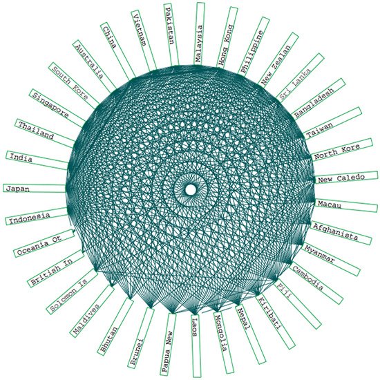
My favorite, by Miguel Centeno and Abigail Cooke of the Princeton Institute for International and Regional Studies is exquisitely beautiful and dense with information. It's titled
International Trade Networks, 2001.
They explain:
"These four “maps” reveal network patterns of world trade in goods in 2001 at four different thresholds. The colored boxes represent countries, clustered in selected regional trade alliance groupings. The green lines show trade relationships between countries for an aggregate of all traded commodities and products. Lines in the multi-color central circles show inter-regional trade; lines in the single-color peripheral circles show intra-regional trade. The thickness of the line indicates the relative dollar value of the trade relationship, with thicker lines representing larger dollar values. Reading from left to right, the first image shows all trade links, the second shows the largest links that cumulatively account for 75% of the total value of world trade, the third shows the largest links accounting for 50%, and the last shows 25%. Together, these four maps illustrate many aspects of the network patterns of world trade. Perhaps the most striking feature is the extreme concentration of value among a small number of countries."The graphic shown is only a tiny piece of the whole. Definitely click through to see the entire piece, which is mindblowing in both its beauty and comprehensiveness, and spend some time browsing through the 56 works in the exhibit.
Some other gems you have to see:
Mitosis, by Jennifer Rea ('06)
Cryptic Coalition, by Trond H. Larsen ('06)
Lichen II, by Amy Morton ('06)
The Sustainable Nature of New Jersey, by Henry S. Horn ('05)
Blood Bars, by Matt Hoffman ('05)
No comments:
Post a Comment