Showing posts with label mapping. Show all posts
Tuesday, May 29, 2007
The US ZipScribble Map
From Robert Kosara at Eager Eyes comes the US Zipscribble map. He says "What would happen if you were to connect all the ZIP codes in the US in ascending order? Is there a system behind the assignment of ZIP codes? Are they organized in a grid? The result is surprising and much more interesting than expected."
Very few of the zip codes connections cross state lines. As a result, you can clearly see the state lines even in the monochrome black and white version. Even fewer of the actual zip codes themselves cross state lines - but a few do.
Interest piqued? More at Wikipedia. Geek away.
Monday, February 12, 2007
Travel-Time Maps
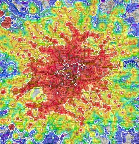
From Nixon*Now comes this color-coded map showing how long it takes to get from one area of London to another. He says:
"These are much more complicated questions than those about individual journeys, but one thing they all have in common is transport: can I get to and from the places I'm considering quickly and easily?"Basically, this answers the question of "how early do I have to get up to work on time?" Now if only someone would make this map for the New York subway system. More at mySociety.
The maps on this page show one way of answering that question. Using colours and contour lines they show how long it takes to travel between one particular place and every other place in the area, using public transport. They also show the areas from which no such journey is possible, because the services are not good enough."
Sunday, February 11, 2007
What Was Hot in the State of the Union Address
I meant to upload this a while ago and am finally getting around to it. If you parse Bush's annual State of the Union address, despite all the bluster you can discern which issues he is turning his attention to and which have fallen by the wayside. This shows how many times each year Bush used the phrases below.
Unsurprisingly, Iraq is bigger than ever this year, while he continues to have amnesia when it comes to Afghanistran. And he's finally starting to talk about oil.
(src: New York Times)
Unsurprisingly, Iraq is bigger than ever this year, while he continues to have amnesia when it comes to Afghanistran. And he's finally starting to talk about oil.
(src: New York Times)
Monday, January 22, 2007
Brooklyn Hospitals Under Fire

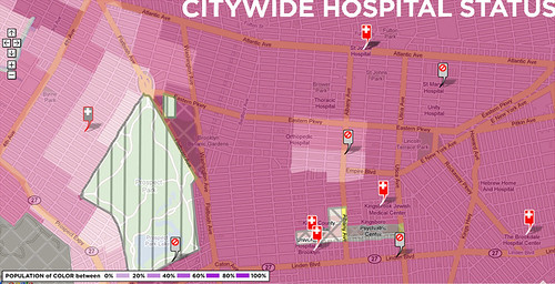
Health Care That Works has merged race and income demographic data from the census with data on New York hospital closures and downsizing. Their research shows that recent hospital closures have had a disproportionate impact on communities of color - six of the eight hospitals that closed between 1995 and 2005 were located in or near communities of color. Their website links to a plethora of reports and other resources.
Saturday, December 30, 2006
From 4 to 300 Million
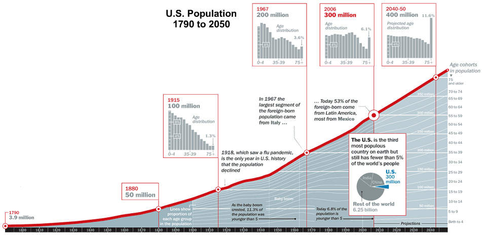
Happy almost new years. As part of my year-end wrap-up, here's third in a series from Time mag looking at the state of the nation. Today: population growth. We've grown from 4 to 300 million in a little over 200 years, and are projected to hit 400 million by the year 2050. India and China still have more people than us, though.
Friday, December 29, 2006
America by the Numbers: Religion
As part of my year end wrap-up, I'm uploading graphics from a Time magazine article called America at 300 million.
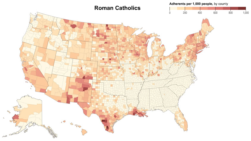
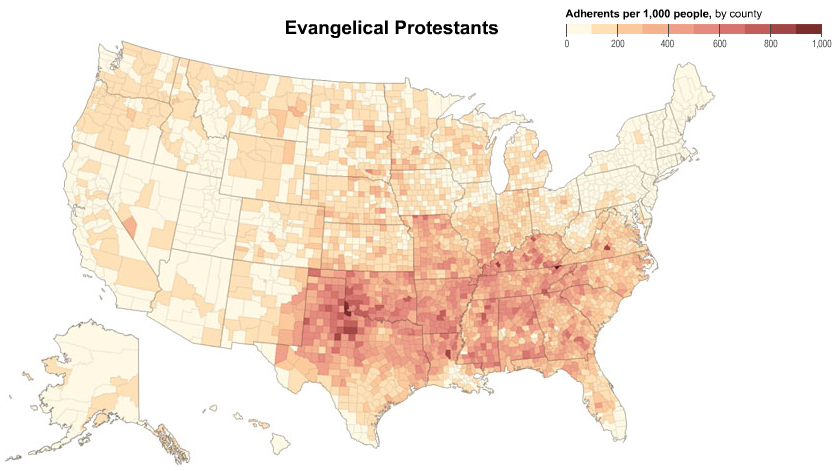
Today: religion. Over three-quarters of all Americans are either Roman Catholic, Evangelical Protestant, or Mainline Protestant. Below - where each group lives.


Today: religion. Over three-quarters of all Americans are either Roman Catholic, Evangelical Protestant, or Mainline Protestant. Below - where each group lives.


Thursday, December 28, 2006
Where We All Live
As part of my year end wrap-up, over the next few days I'm going to be uploading an interesting recent cover story by Time Magazine on America at 300 million. It does an elegant job graphically describing who we are.
Click to see the map larger.
Today: where we all live. The top five most densely populated areas are New York, LA, Chicago, Philly, and Dallas-Fort Worth. Go New York! New Jersey is the most densely populated state. You might ask why. I have no answers. On the other side of the spectrum, Alaska has only one person per square mile, and Loving County, Texas is the most sparsely populated state in the contiguous US.
Click to see the map larger.Saturday, December 02, 2006
Racial Dividing Lines in Brooklyn
In an article looking at Ratner's Atlantic Yards project through the prism of race, the New York Times produced the above map of racial distributions in central Brooklyn.Flatbush Ave cleaves black and white Brooklyn, with much of the area to the northeast of Flatbush more than 50% or 75% black, and much of the area to the southwest of Flatbush more than 50% or 75% white. Areas of downtown Brooklyn, Fort Greene, Prospect Heights, and Gowanus are "diverse," meaning neither blacks nor whites make up more than 50% of the population.
I would love to see data comparing changes in neighborhood racial demographics to changes in what neighborhood an area is called. The area considered Park Slope several years ago pushed below 5th Avenue, and is now creeping below 4th Avenue, if not further. The map shows that this corresponds to a diverse area that is becoming more white. Similarly, will the dividing line between Crown Heights and Prospect Heights continue to move west, paralleling the movement by whites into a neighborhood that had been almost exclusively black?
Friday, December 01, 2006
Maps of Imaginary Worlds: My Father's Dragon
My Father's Dragon was written in 1944 by Ruth Stiles Gannett and illustrated by Ruth Chrisman Gannett. Fifty years later, the story was made into an anime movie in Japan.
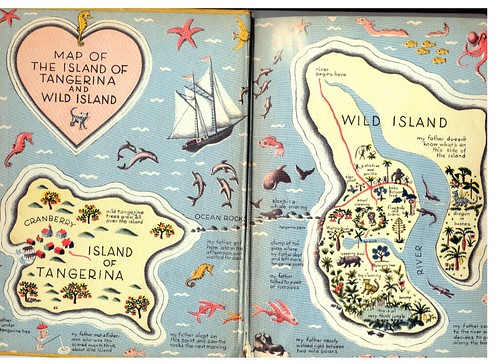
The book is about the main character, Elmer Elevator, running away to Wild Island to rescue a baby dragon. Here's the map of his world.
Subscribe to:
Posts (Atom)